State of Preact Devtools #2
tl;dr: The extension is progressing nicely and I consider it feature complete for an initital release. There is lot's of polishing to be done, but the pieces are falling together.
A little bit of time has past since the announcement that we are working on our very own devtools extension. A lot has happend since then and I'd love to share some news about what's happening behind the scenes. The good news: I'd consider the current code feature-complete and the next will be the polishing phase. It's safe to say that things are progressing nicely without any hiccups.
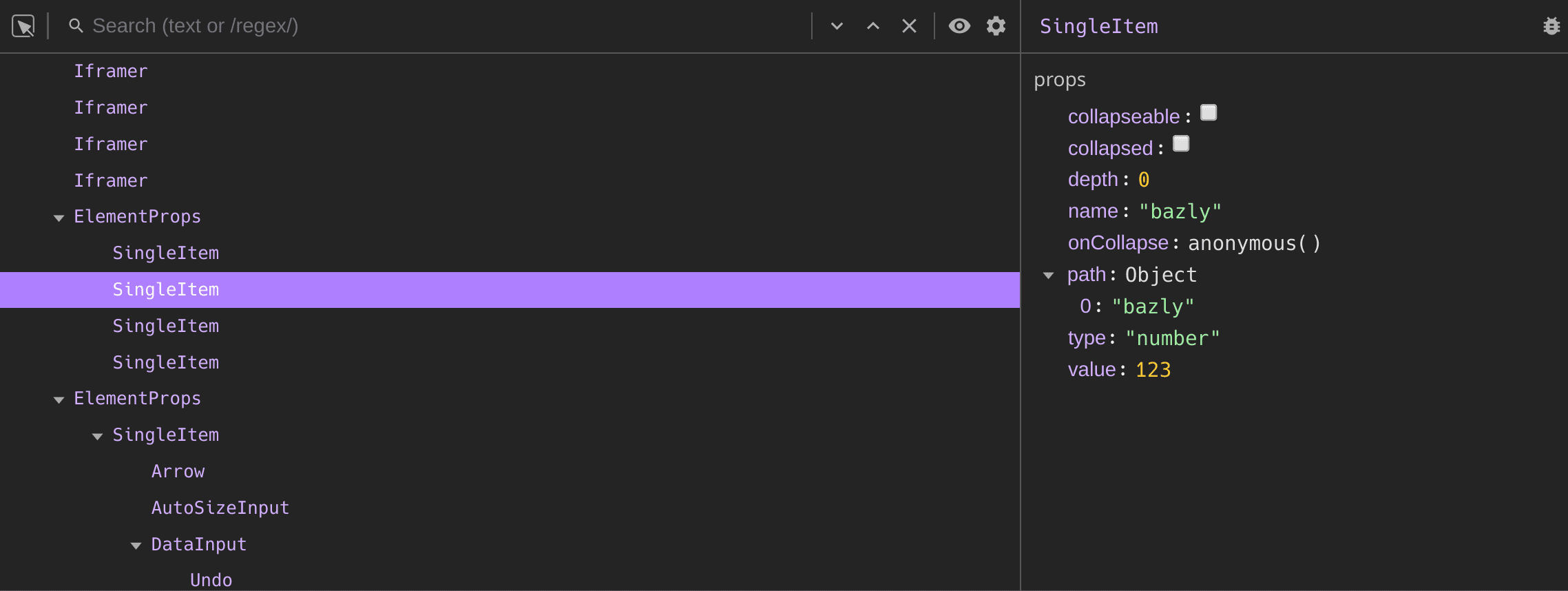 Screenshot of the current state of the extension.
The main star of the show is obviously the element viewer itself. Having a way to peek at the component tree is incredibly helpful to understand how the screen was rendered. On the surface sucha a tree-view seems easy enough to write down, but when I compared all the devtools from other frameworks and browsers I noticed lots of UX differences, which in my opinion can really make (or break) the usefulness of the devtools.
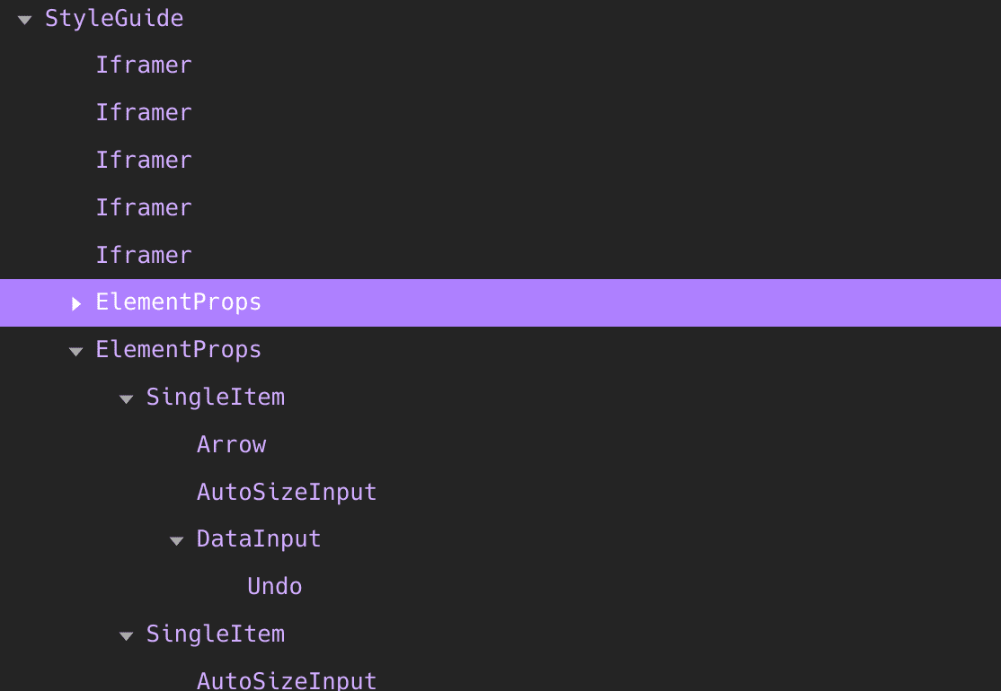
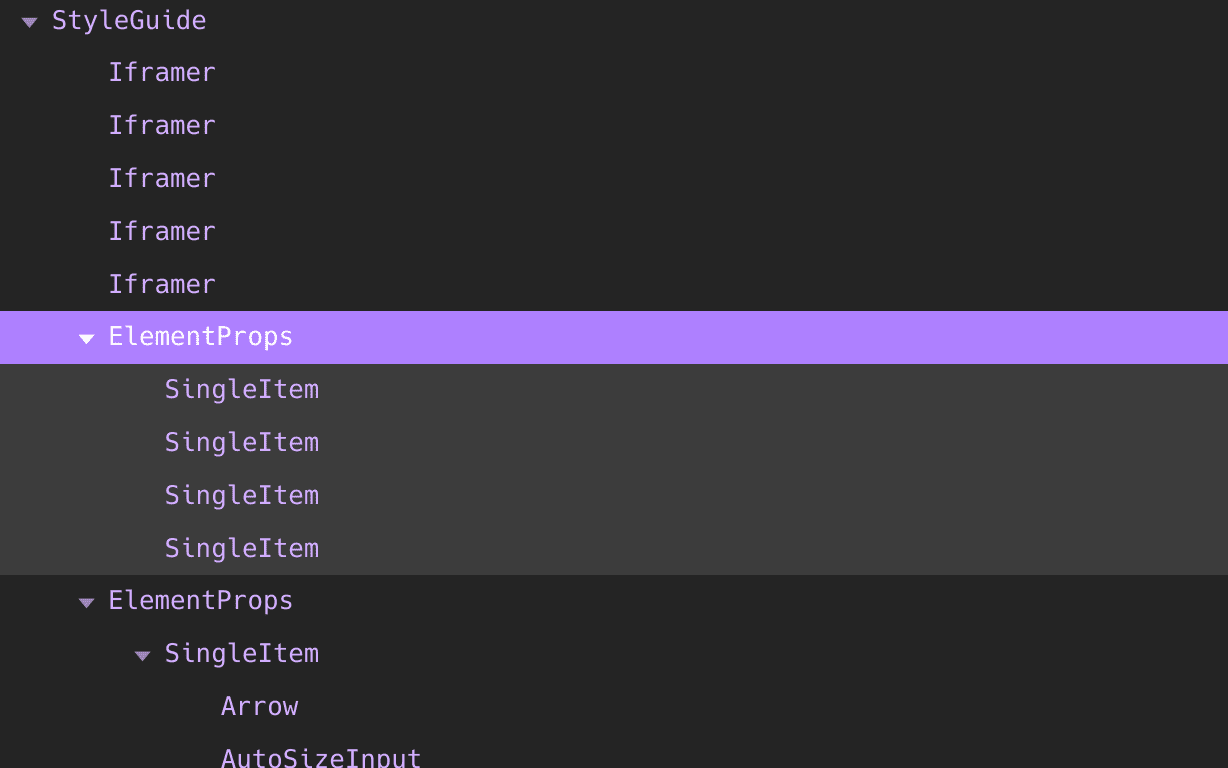
Pressing the right arrow key here should uncollapse the tree and move the selection to the first child.
Personally, the arrow keys get a lot of usage on my machine. I'm using them as one of the main ways to navigate around and collapse/hide component trees. It's suprising to me that this is sometimes overlooked or has issues like only moving one position when holding down an arrow key. Even if the keyboard navigation is present, one has to make sure that the viewport follows the currently selected item. Otherwise it would move out of sight, hidden behind some scrollbars.
In the end I personally liked the UX of the react-devtools extension the most. It's no secret that Brian Vaughn and the other members of the React team have done an outstanding job there. This is something that I always tried to keep in mind when writing the devtools extension for Preact, because I know a lot of in my area who frequently switch between Preact and React projects. Deviating too much there would ailenate their workflow and cause unnecessary friction for our users. It some minor differences though, which we'll go on in detail later.
Filtering for a less cluttered view
The component tree can get quite long, especially when a css-in-js library is used which creates an additional component for every styled DOM node. This often leads to cluttered component trees, making it hard to see the ones that matter. It's another feature I frequently make use of when jumping between projects and I tried to change the UX a little to better reflect the quick need of changing some filters.
Instead of opening them in a dedicated modal, they'll open in a simple
popover without hiding the tree view. The built-in filters to hide
Fragments or DOM nodes are always present, so that you can easily
toggle them on or off. Note that if you uncheck the Fragment filter,
you'll always see a Fragment at the top of the tree. This is because
we're re-using Fragments as root nodes in Preact.
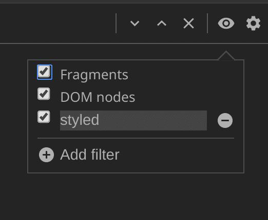
The new filter popup where you can quickly hide specific components. Don't mind the visual glitch with the focus ring. This will be fixed.
Clicking on the Add filter button will add a new one, where you can
enter a partial component name, that should be hidden. It will
directly focus the text input field, which is another little UX detail
that makes a difference in day-to-day usage.
Searching for a specific component
When you're implementing filtering into something you'll probably will
want to add it's cousin - the search - too! There are always times
where you need to find specific components and see their hierachical
relation in the tree to other components. The search feature does
exactly that and works very similar to the native ctrl + f / cmd + f
feature found in all browsers.
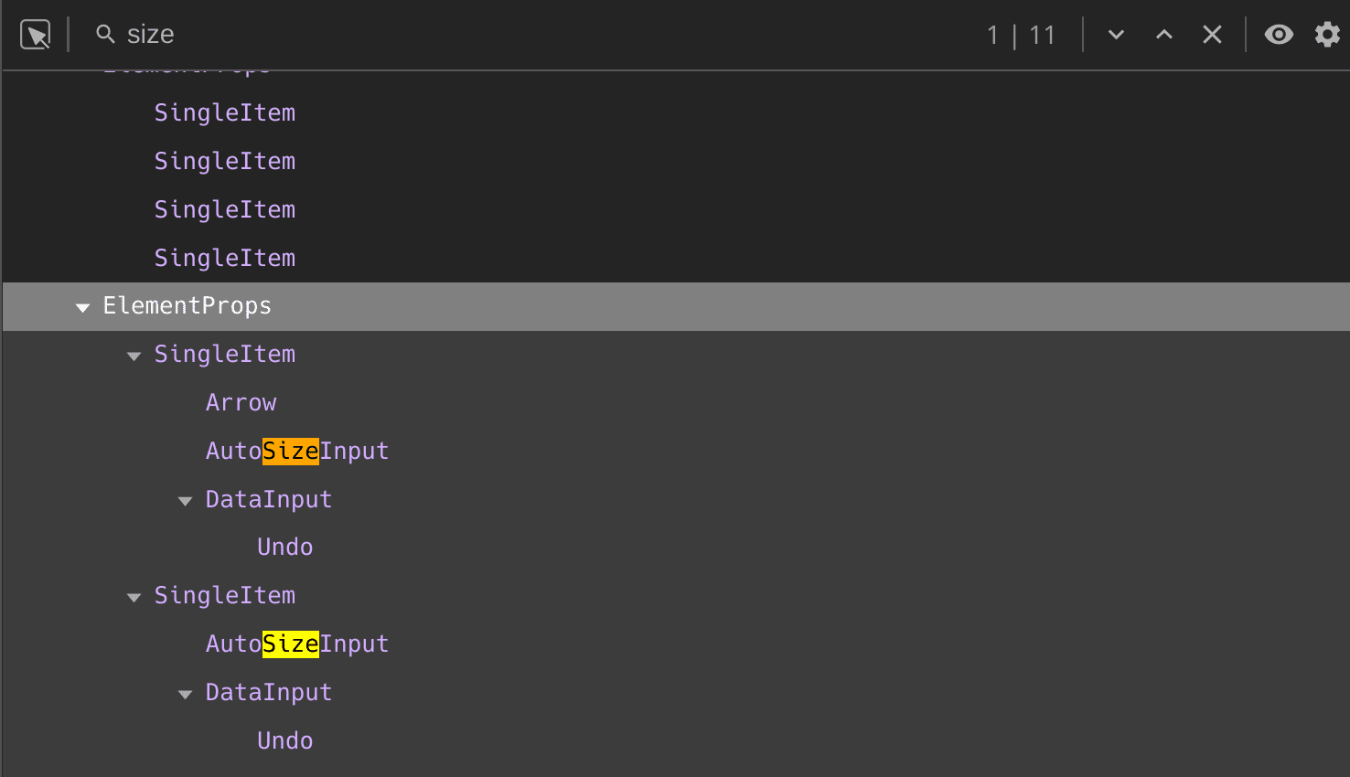
But I also made sure pay particular attention to the same little UX
features like with the tree view. In this case just pressing Enter
will highlight the next search result and pressing Shift + Enter
will do the opposite. The latter is often forgotten in different
implementations.
Full on props modifications encouraged
Equally important as the tree view is the sidebar panel where props,
state, context and later hooks (upcoming feature) can be
inspected and modified at-will. For me this aspect of the web has
always been the most exciting. We can modify pretty much anything we
want and can see the results immedialely. I do think a tight feedback
loop makes a world of difference during development.
For this reason I was blown away when I came across this PR in the react repo, that allows
more freedom when editing values. You know the old devtools where
always a bit lacking in that regard, because you could only modify
"primitve" values like booleans, strings, numbers, etc, but
never arrays or objects. On top of that there wasn't any way to
interactively add new props like you can when adding CSS properties
in the native HTML elements panel.
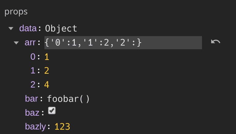
Changes are immediately reflected in your app and you can even undo them in case you they turned out to be wrong.
In short I fell in love and it became a thing I absolutely wanted to
enjoy in the devtools for Preact. Two days later the code got
committed and thanks to the excellent json5
library the input for complex objects was pretty easy to do. It
publish an fork which supports the ES modules syntax (json5-es)
until the PR is merged in case you're interested.
Component Holmes Inspector
In the scenario that you know what component rendered a specific element on the page, you can use the neat inspect button which allows you to just click on the element on the page and it will automatically highlight the correct node in the tree view.
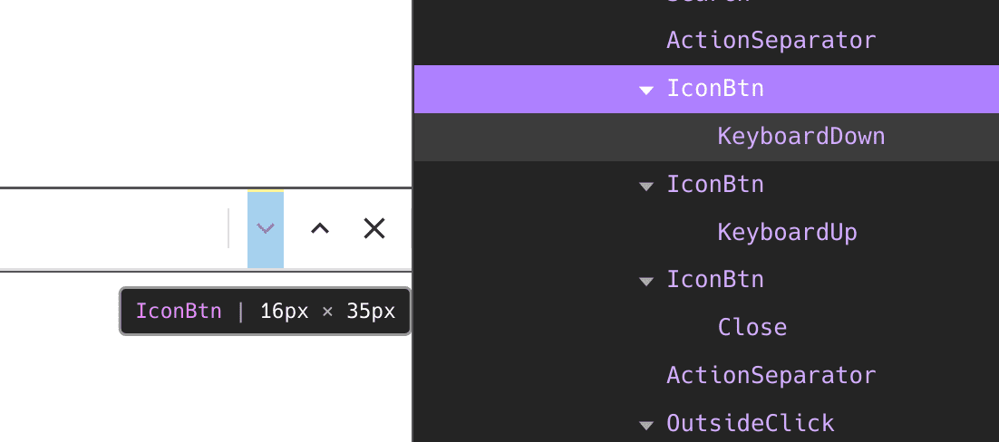 Inspecting the devtools with devtools... That's meta!
This again may seem like a simple feature, but quickly gets more complex once you add fitlering to the mix. Because what happens when the inspected element is filtered away? The solution is to just walk upwards until you find a non-filtered parent. It's doable, no doubt and no complains here, but it's another thing to be mindful of when adding such a feature. The same is true for collapsed subtrees. There you need to uncollapse them as you go.
What's next
Now that I feel confident to have a solid feature-set for an inital release, I'll spent the next available time slots on polishing all the things. There are still some obvious bugs here and there which need to be shaken out. The polishing phase is not to be underestimated from a planning perspective, but there aren't any blockers there. It just takes a bit of time.
After that there are many features that I have set my sights on. One
of them is hooks state which I have skipped so far, because it
needs some modifications to preact/hooks before this can work. I
still feel like I haven't found the right way™️ to go about it yet.
I'm also very interested to get some sort of highlight-updates added
as it was feature I really loved and used a ton in the past. We'll
see, time will tell ;)
I'm not sure how much time I'll be able to dedicate to that during October, as I'll be touring around on various conferences and Meetups. One is the frehsly baked localhost.engineering conference in Düsseldorf, Germany and the other one is scriptconf which will be held in Linz, Austria. If you share, be sure to hit me up for chat. And I'll bring a good bunch of stickers with me in case you fancy those ;)
